Nought
Zero-Proof Cocktails
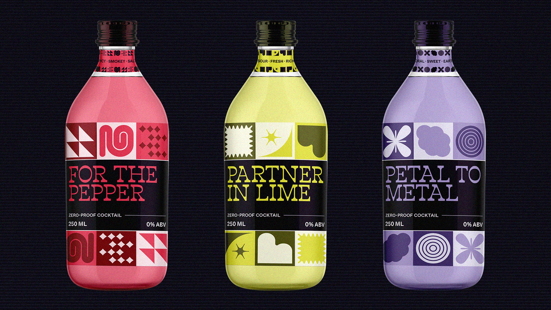
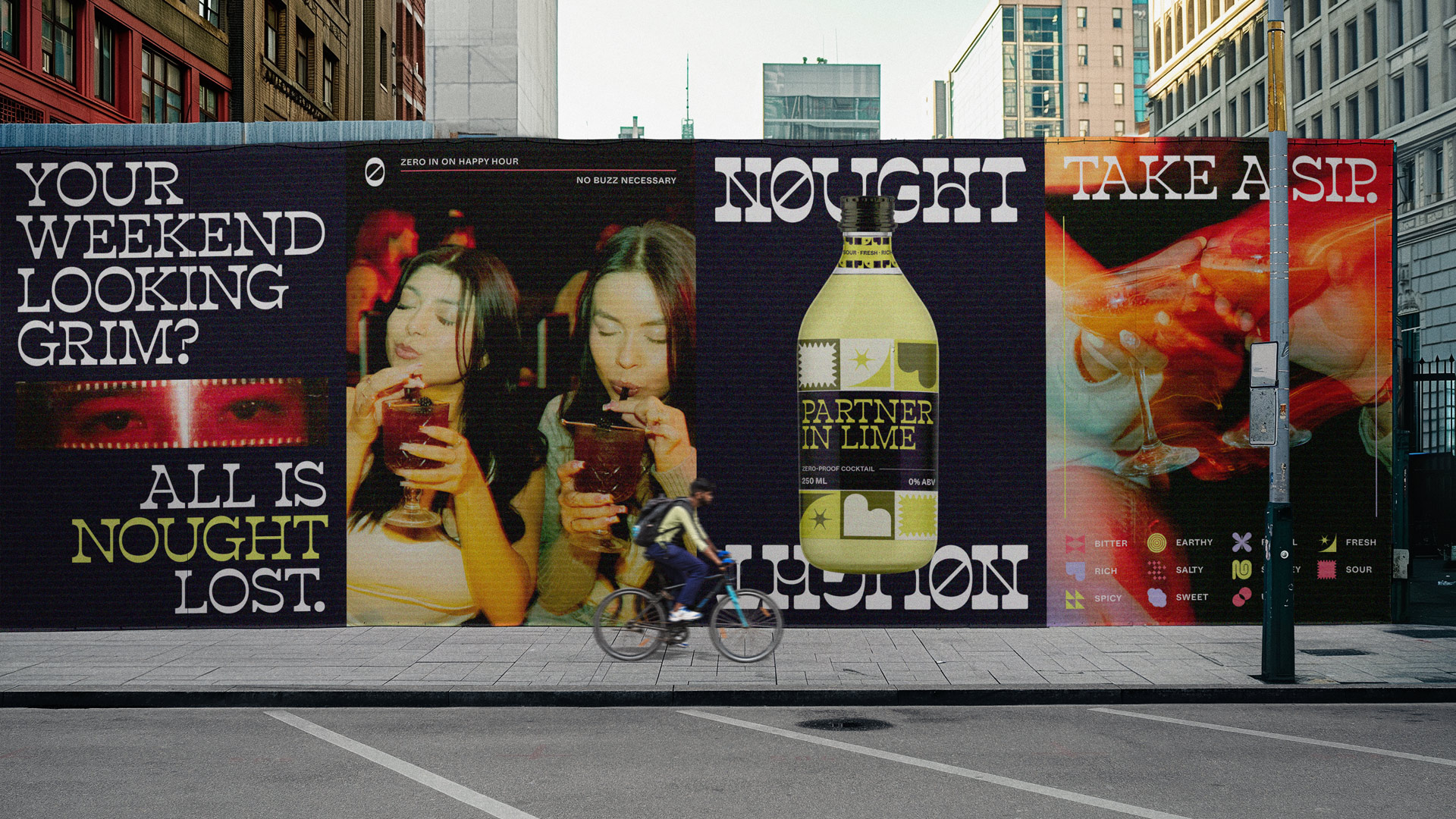
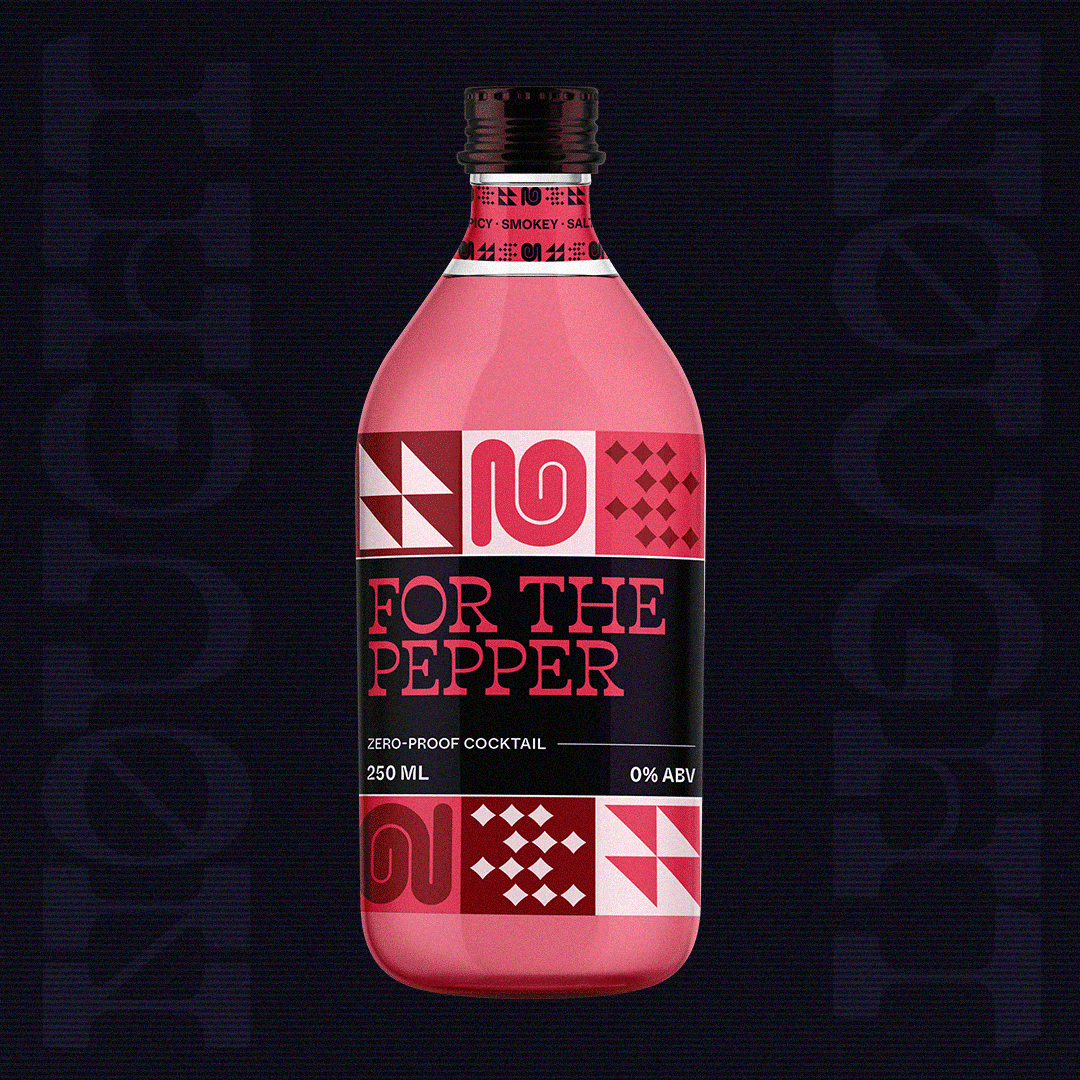
Nought is a zero-proof cocktail brand shaking up what sober looks and tastes like. These flavour-forward beverages were made for curious sippers who crave creativity, not compromise. Each drink features eye-catching symbols that capture an abstract take on what’s happening on your tongue. Take a sip—that’s a promise.
RGD Award for Packaging Design (Series)
Honourable Mention, 2024
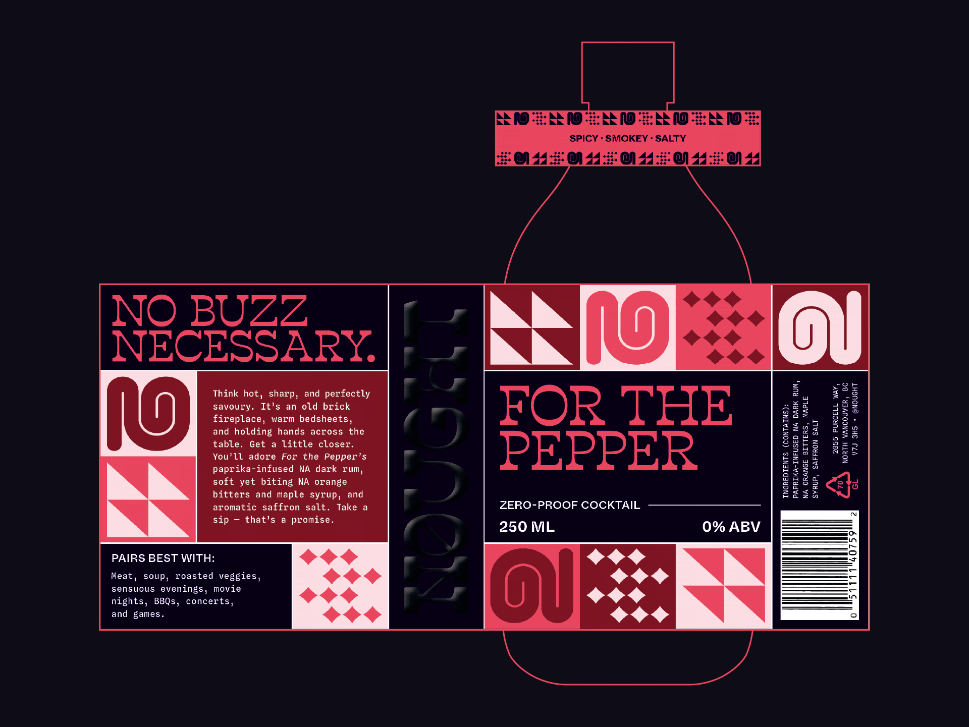
No buzz necessary.
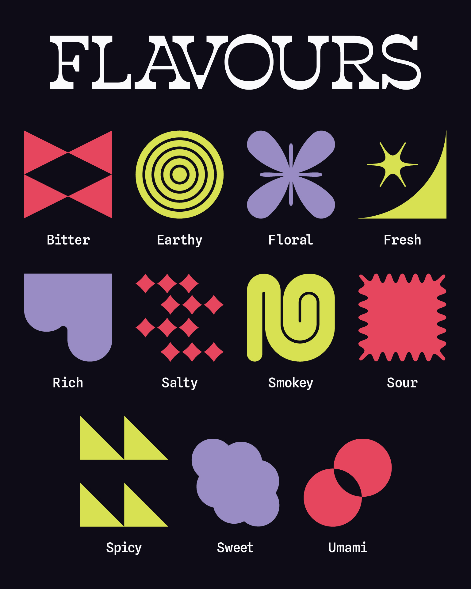
What does “sour” look like? Earthy? Spicy? Umami? What about all of them at once?
Nought answers those questions by emphasizing visual taste. Flavour is a wild and wonderful sensory experience; let’s drink it all in. The packaging totes custom “palate patterns” built from a conceptual graphic system. Mixing and matching the eleven symbols inspires creative combinations, like orange bitters and saffron salt. Evoke more sensation with each drink’s suggested pairings, perhaps an old brick fireplace or top-down convertible.
Even the name plays its part. Nought is a nod to zero, yes, but also to starting from scratch, making space for something new. It sets the tone for a brand that doesn’t just exist without alcohol, but thrives without it. There’s nothing wrong with the classics, but we deserve more than Shirley Temples and seltzers. Nought invents new ways to party.